

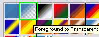
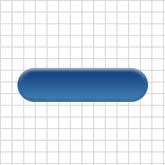
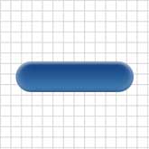
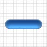
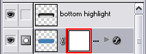
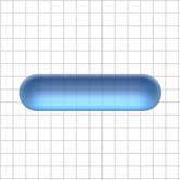
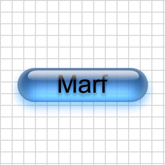
This tutorial is "How To Make An Aqua Button", 1. Create a new 340x340 pixel document and name it Aqua Button. Now make a pattern of your choice and make it the background. Then show channels, and create a new channel. 2. Next in the new 'alpha 1' channel, select the elliptical marquee tool, and make a circle with 70 x 70 pixel dimensions. This will be the rounded edges of your button. Next select the rectangular marquee tool. You will want to start the selection right near the top middle part of the circle, and then drag it out to the right until the height is 70 pixels as well. If it's not completely aligned with the circle after your done selecting, then use the arrow keys to adjust then fill, the selection with white. See image to the right. 3. Now you will have something like a rectangle, but one end is a half circle. Now make a selection of the half circle and some of the rectangle, like this: Now you want to flip the selection horizontally, then click and drag the selection to the right so it matches up. If you are having trouble matching the edges up, Try holding down shift, it locks the image to the x, y and x+y axis while dragging. Then you want to align the image to the vertical and horizontal centers. 4. Now you want to load the selection from the alpha channel. Then show layers, and create a new layer and name it 'button back'. Show colors, and use the color [R: 66, G: 127, B: 180]. Then fill the selection. Now my pill is about 270 width by about 70 height. Now remember that if you are doing a smaller size, you might get a wierd outcome. Best idea is to make it the same size as mine, and shrink it later. Now deselect. 5. Now in the next few steps we are going to apply many layer blending options to the button back layer. First off we will apply bevel and emboss with these settings 6. Press D, to reset foreground color to black. Now apply a gradient overlay with these settings In the Gradient box, Select the Foreground to Transparent (Second Option). Note that the box may not be black, but select it anyways. 7. Now the last two styles you can add. The first one is an inner shadow with these settings Then finally do satin with these settings 8. Now load the selection from the 'button back' layer and contract the selection by 10 pixels. Then contract the selection by 6 pixels. Then feather the selection by 7 pixels. Now you are going to Layer > New Layer.., and a window should pop up. You want this window to popup, that's why we create a new layer by going through the menu. Now in this new window, name it 'bottom highlight' make the Mode: Color Dodge, and then check the box 'Fill with Color-Dodge-neutral color (black). Now press ok, then Press D then X to reset the foreground and background colors. Now fill the selection with white. Then change the fill percentage to about 40%. Then hold shift and press the down arrow twice. Then load the selection from the 'button back' layer again, and inverse the selection, then press delete. Now deselect. 9. Next, create a layer mask on the 'button back' layer. Now load the selection from the 'button back' layer, and contract the selection by 10 pixels, then contract it by 6 pixels, then feather it by 7 pixels. Now click on the layer mask. and fill the selection with 45% Gray [R: 161, G: 161, B:161]. Then deselect, and gaussion blur the layer mask about 18 points. 10. Next, select the rectangular marquee tool, and create a selection like this: which is 200 pixels wide and 20 pixels tall. Then show channels and create a new channel. Now fill the selection (with white). Deselect, then distort the white area like this, and hold down Ctrl + Alt + Shift for the effect to be equal on both sides. Now apply a gaussion blur with settings [Radius: 10 pixels]. Now you will want to adjust levels with these settings 11. Now load the selection from that alpha channel and show layers. Make a new layer, name it 'upper highlight'. Press D to reset the foreground and background colors, then select the gradient tool. Now select the linear gradient, and drag from the bottom of the selection to the top, like so. Then change the 'upper highlight' layers blending mode to 'Screen' and the opacity to 75%. 12. Finally, click on the horizontal type tool and then click in the button where you want text. Type in your text, and make sure your foreground color is black. Then you want to drag the type layer inbetween the 'upper hightlight' layer and the 'bottom highlight' layer. Now apply a drop shadow with these settings: Almost done! Select the 'button back' layer and apply a drop shadow with these settings There you have a cool looking aqua/glass button or pill.
It is a very good tutorial and explains fully what to do,
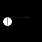
I have tried and tested it and it works fine for me, any problems let me know and I will do my best to help you.
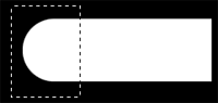
 .
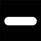
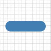
. 
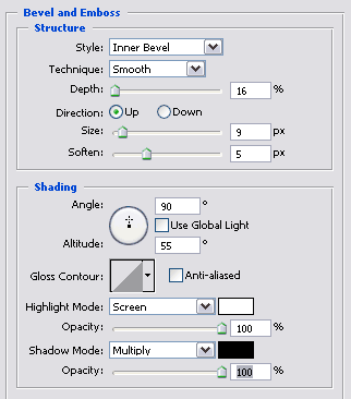
Thursday, 24 May 2007
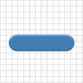
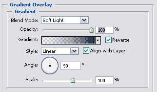
How To Make An Aqua Button
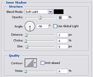
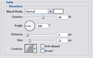
Tuesday, 22 May 2007
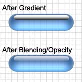
How To Make a HDR Image Using One Picture
This tutorial is very interesting and useful,
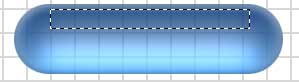
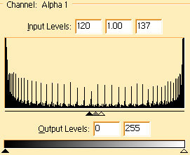
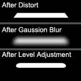
It is how to fake a HDR image using Photoshop and only one image! Easy to follow
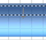
with a good outcome/end product.
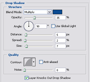
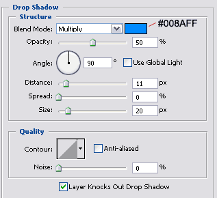
Fake HDR in Photoshop
Maybe you love photos which looks like painting, maybe you hate it. Anyway it can be useful to know, how to do it. This tutorial shows quite easy way to fake HDR photos in Photoshop. You don't need to shot into RAW or take photos with different exposure - one JPEG is enough. If you can work with masks in Photoshop, you have an advantage.
The most important is first step, it is base of HDR look made in Photoshop. Use command image > adjustment > shadow/highlight and set up values: shadows amount:50%, tonal width 45%, radius 44px; High-light amount 67%, tonal width 65%, radius 46px;
Duplicate layer "base" and set up its layer interaction to Color Dodge. This interaction gives picture strong colors and cause that light areas turn into pure white. In next step it will be repaired by another layer interaction.
Do the same thing as in the second step, but layer interaction is set up to Linear Burn now. You can see big black area in picture, it has to be elimated. Set up foreground color to black and use command select > color range, fuziness should be set to around 100. Now click on red marked icon, new layer mask will be added and black will disapear. There are some ugly artefacts in the picture, to remove them, click on layer mask and use gausian blur filter.
Fourth step is easy, it profits from third step. Just duplicate layer "linear Burn", set its interaction to Overlay, select layer mask and pres ctrl+i (invert). This interaction darken too much light shadows and raise contrast. Layers and its interactions are very powerfull tool in Photoshop.
Now it's time to adjust picture look, try to experiment with layer opacity. Optimal values are about 40% for layer "Overlay" and 55% for layer "Linear Burn".
Set up foreground color to white and use command select > color range with fuziness set up around 100. "Crawling ants" will appear around light areas. Duplicate "base" layer and move it up, then click on icon add layer mask. Select layer mask and soften it by gausian blur filter.
The last step colorize picture into red tones. Click on red marked icon and select from menu gradient map. This layer adjustment tools modify image colors according to defined gradient. There is a model gradient at the right border of picture. Load selection from layer mask of layer "light", invert it (select > invert) and click on add layer mask icon. Set up interaction of layer "colorize" to Hard light and finaly set opacity to 72%.
I use some other adjustmenst to achieve this look. For example I fill white areas by photoshop generated clouds - filter > render clouds.
Tutorial From: http://www.hdrphotos.net
Tuesday, 15 May 2007
Creating A Smoke Effect Using Smudge Tool
This tutorial is about how to make a smoke effect in Photoshop using a simple black line and the easy to use smudge tool, very easy to follow and understand.
Smoke Effect:
Step 1:
Using the "Brush" tool simply draw a straight black line down the centre of the page.
Step 2:
Now using the smudge tool, click and drag from side to side whilst moving downwards aswell this therefore creating a zig zag movement with the mouse..JPG)
Step 3:
After doing this simply amend any parts which you think could do with improving by just simply dragging the smudge tool over the parts you want re-doing.
Step 4:
Use this effect in any way you want, for instance I have attached a picture of a cigarette to it, making it look like the cigarette is lit.
Thanks For Reading, Hope This Has Helped
Creating A Transparent Counter Strike: Source Spray
This tutorial is a quick and easy guide on how to create your own personal transparent spray for Counter Strike: Source !
Step 1:
First open up Photoshop and create a new document, get the picture you want to use and paste it into your new document.
Step 2:
Next get the magic wand and select all of the inside of the image
Step 3:
Next group all of the layers and then choose the "Channels" tab, located next to the "Layers" tab, then click "Create New Alpha Channel" button

Step 4:
Next press "D" to reset to default colours and then press "ALT + BACKSPACE"
Step 5:
Next go back to the "Layers" tab and press "CTRL + D" to deselect all, then click on the layer you are working on to select it, then fill in the background with a grey colour, then save as a "TARGA" file and upload to Counter Strike: Source through the "Options" button on the main screen of the game.
Step 6:
Get Spraying !!!!
Hope this tutorial helped you, feel free to leave any comments if you find any problems with it !
Creating An Icon For The Address Bar Of Your Blog (Favicon)
My first tutorial is how to create a "Favicon" for the address bar of your blog,
It is a step by step tutorial of how to create and upload the "Favicon" to your blog.
"Was This Tutorial Helpful ?" Leave a comment with your answer.
Creating a Favicon !
Step 1:
Open up Photoshop and create a "New" document with the size of the document set to 16x16 pixels.
Step 2:
Zoom into the square so that it can be easily seen, then choose the "Text" tool and write what you want to be on the Icon, for example mine is "SB" so this is what I type.
Step 3:
Next right click on the selected layer and choose "Blending Options" then pick all of the options which you want to include, on this example i have added a drop shadow, an inner shadow, it has been bevel and embossed and I have also added a colour overlay.
Step 4:
When you are happy with the final image then click File > Save As, and then choose JPG and then type .ico on the end of the file name instead of .jpeg this saves it as an Icon file which can be uploaded.
Step 5:
Go to MyFavatar and register.
Follow the steps on this website on how to upload your Icon, next click on "Edit Blog" then enter your blog details, after this click on "Favatar Codes" and follow these steps into entering this code into your "Template HTML Code" this website tells you where abouts to paste the given code into your blog.
Step 6:
Finally after pasting the given code into your blog admire your "Favicon" on the tab/address bar.
Hope this has helped you,
Thanks for reading
Monday, 14 May 2007
Welcome
Hello and Welcome,
This is my new blog on Photoshop Tutorials, I will be providing weekly updates including new tutorials and existing tutorials in which I have found whilst searching the internet.
Thanks for visiting,
and I hope you find what your looking for.
|
Consolidation Loans
Find a great loan deal with Accepted.co.uk! www.accepted.co.uk |


